Advena Nota
2021
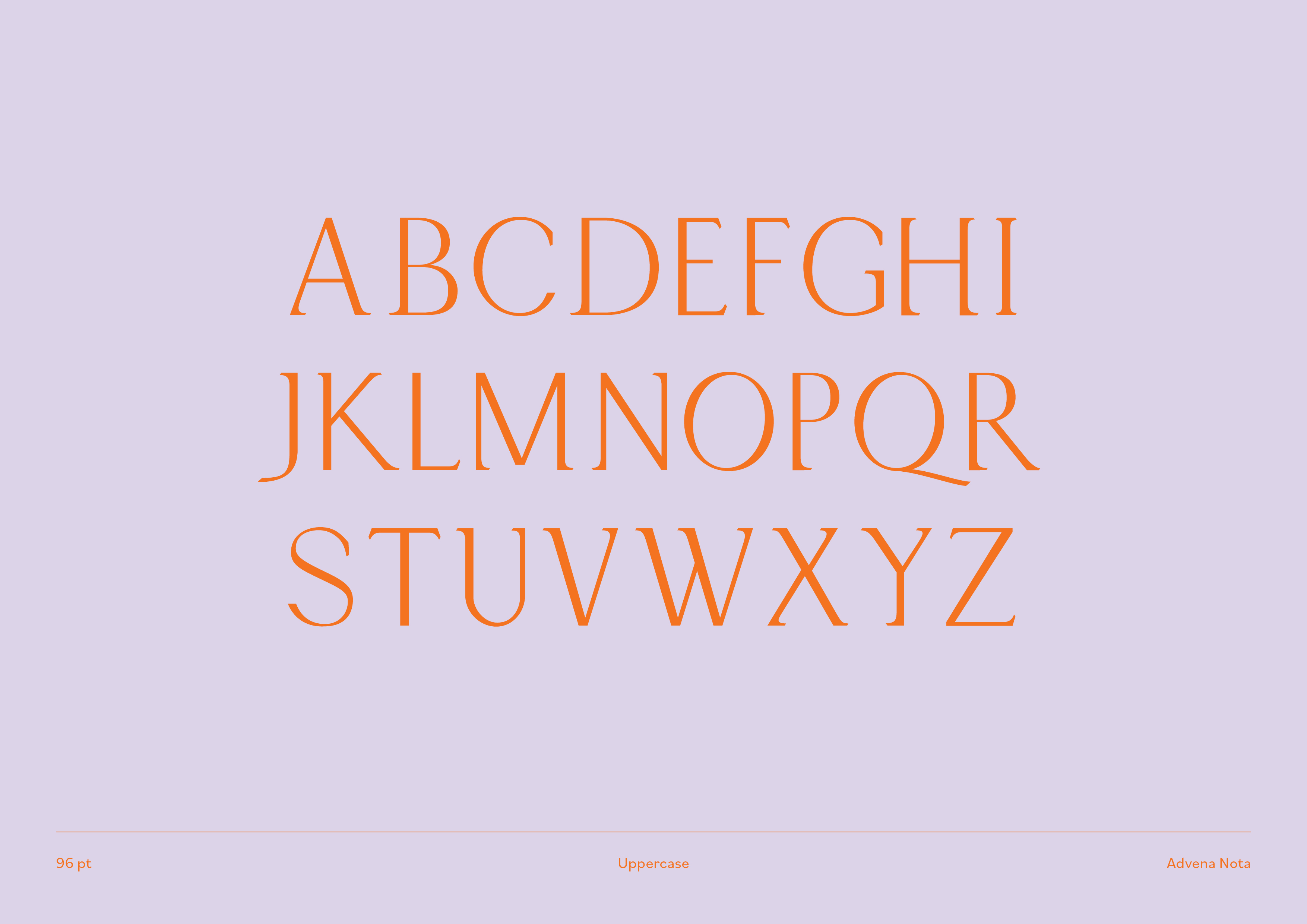
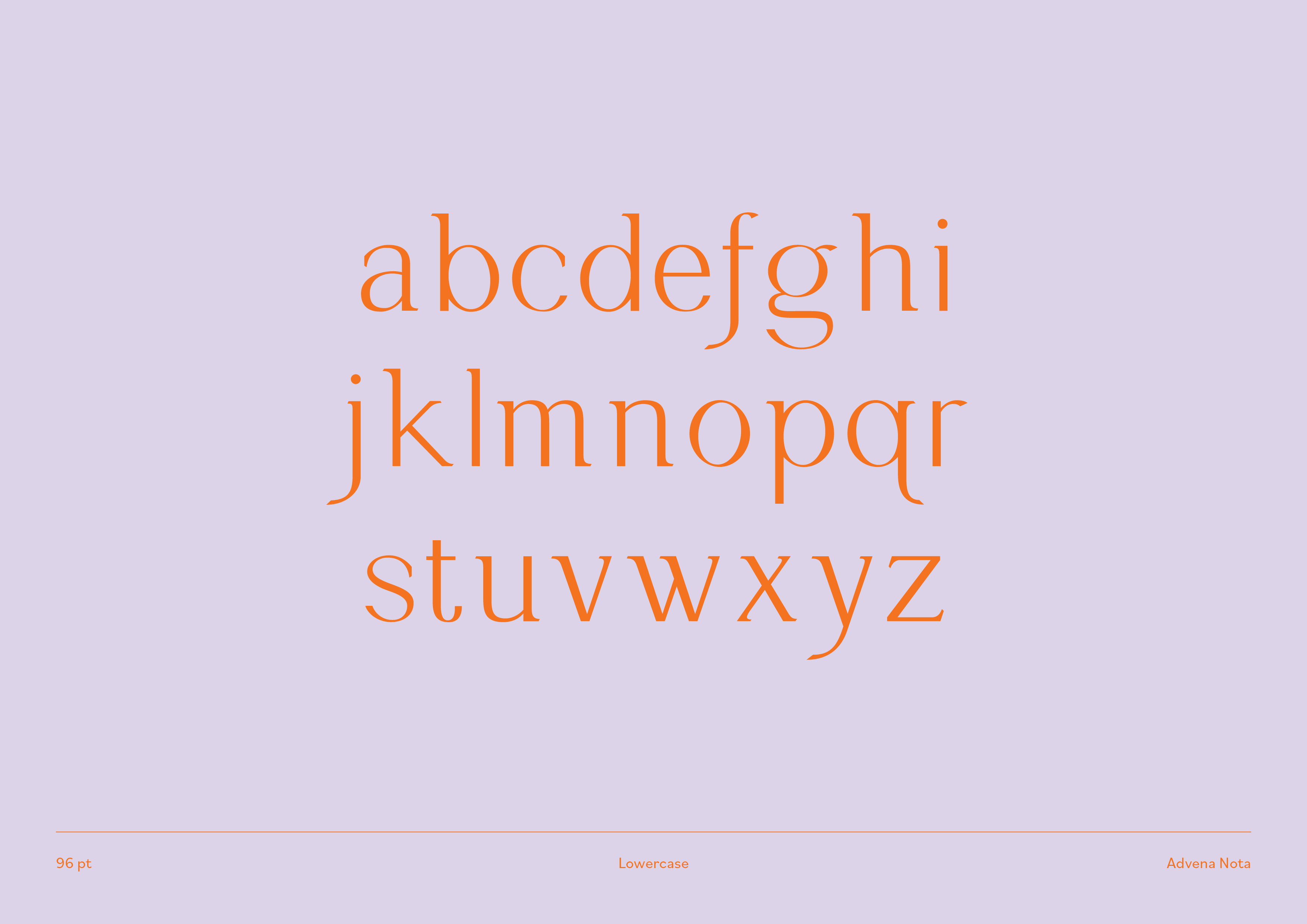
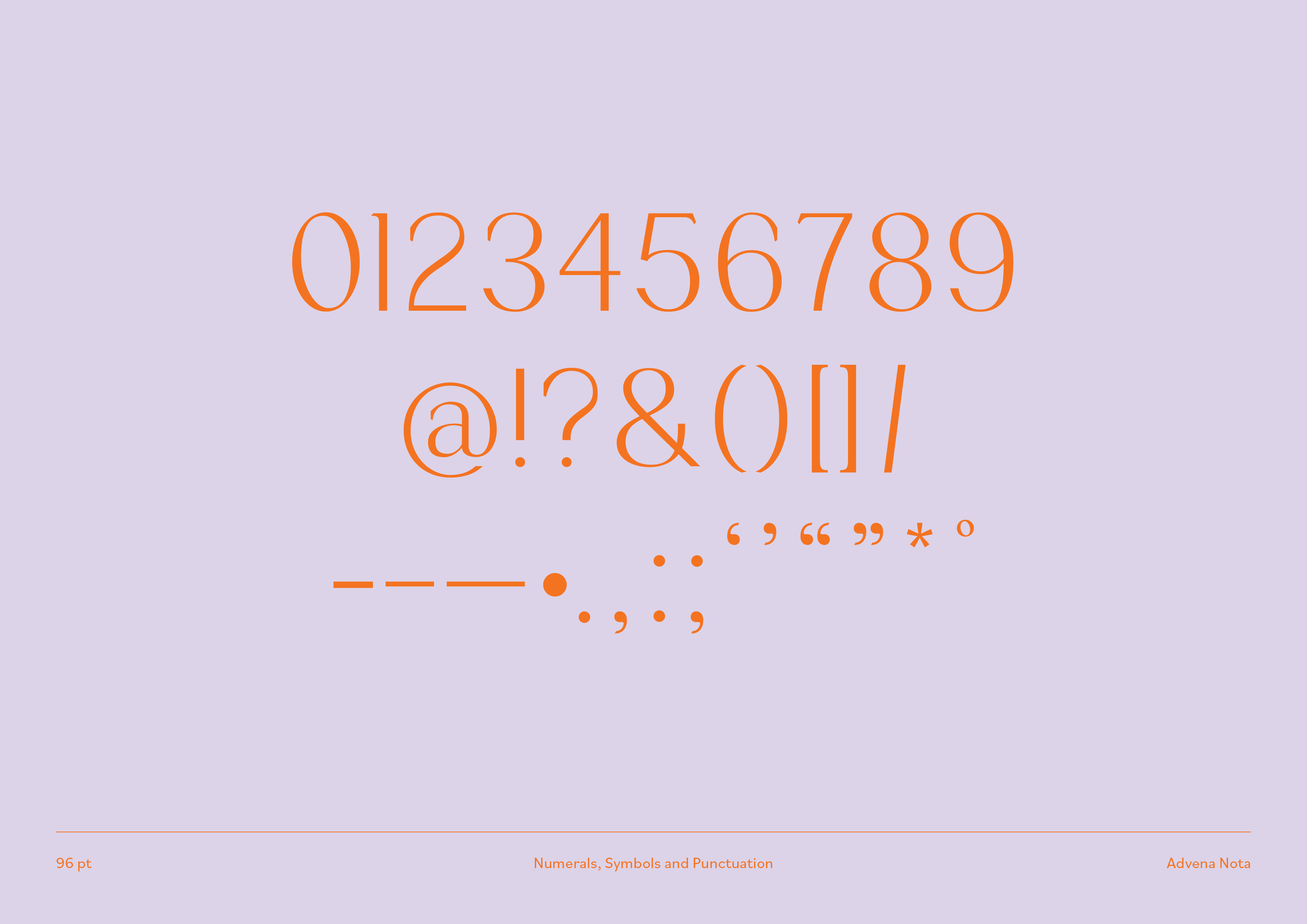
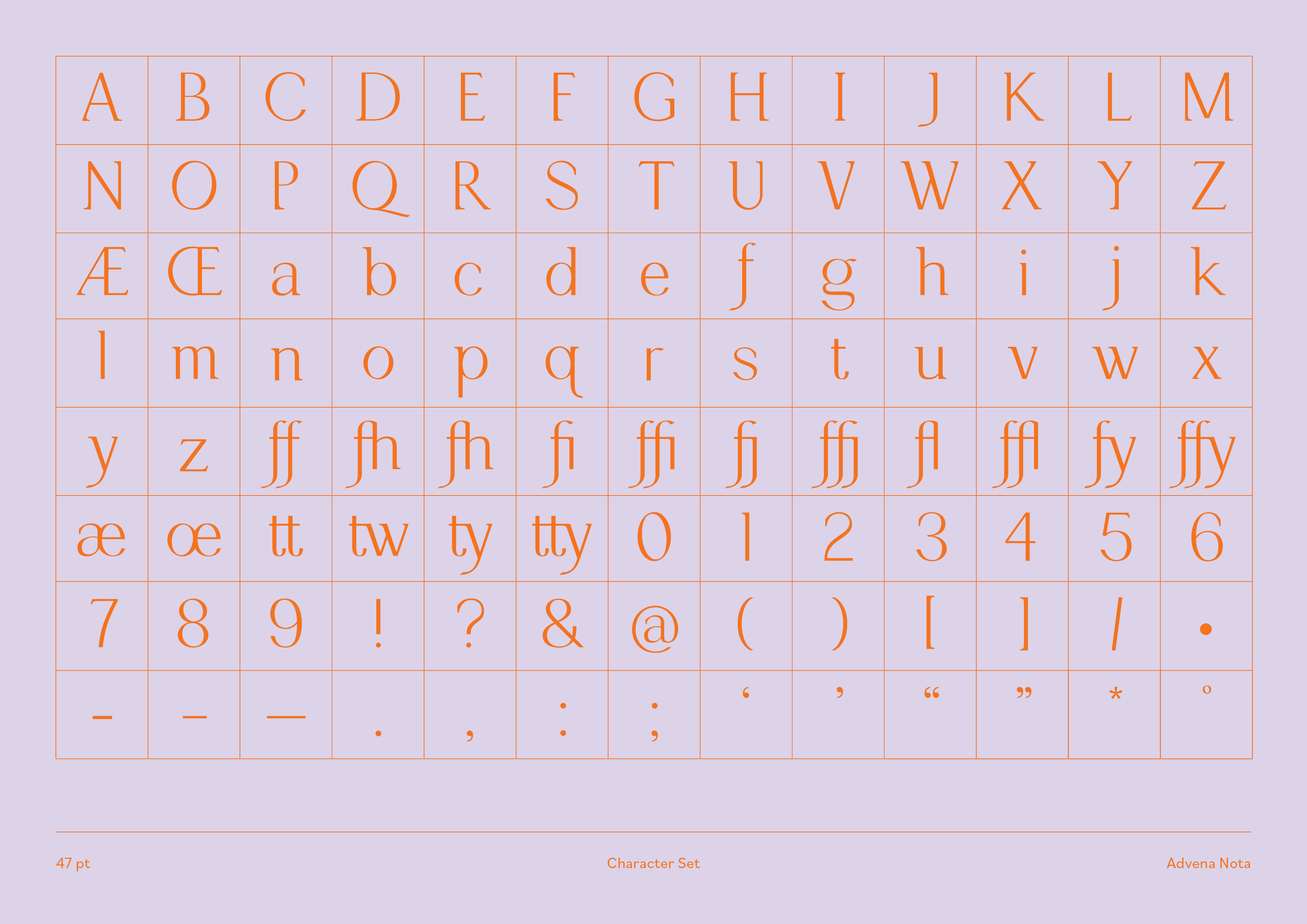
Advena Nota is a typeface built upon dichotomies: outsiders/citizens; old/new; and the ancient/modern worlds. The name dervies from Latin: Advena meaning ‘stranger’, and Nota meaning ‘familiar’. Used for an exhibition on ancient Rome, it aims to help visitors to draw parallels with their own lives and relate to everyday ancient Romans.
While the typeface draws on ancient Roman styles of lettering, it is made distinctly contemporary through its unusual letterforms and ways of taking ancient elements of Roman typography: Its mix of modernist, sharp edges and curved, ‘half-serifs’ pointing in the same direction.
Supervised by Vincent Chan (Matter of Sorts)︎︎︎


© Mei Li Tan 2020–2023. Unauthorized use and/or duplication of this material without express and written permission from this websites’s author and owner is strictly prohibited. Excerpts and links may be used, provided that full and clear credit is given to Mei Li Tan, with appropriate and specific direction to the original content.