Past Prescence:
Dutch Medieval Typeface Revival
2021
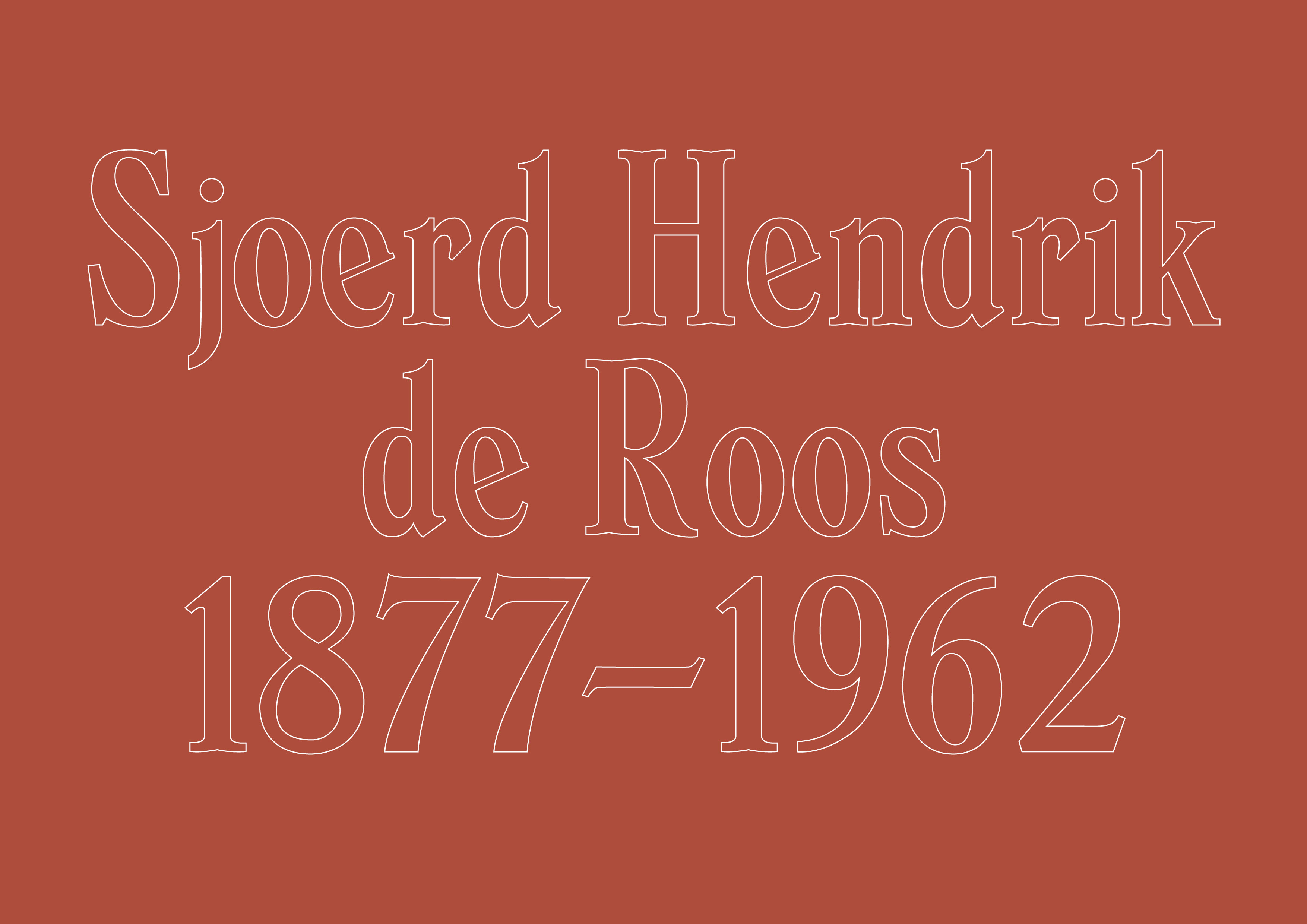
As part of a Digital Font Design class, I revived Sjoerd Hendrik de Roos’ typeface Dutch Medieval (Hollandsche Mediæval), based on a type specimen from the early 20th century published by the Amsterdam Type Foundry. I also added several glyphs to the typeface that were not provided in the type specimen, including the ampersand, asterik, square brackets, slash, en dash and em dash. My revival of Dutch Medieval also features distinct, sharper indents at the terminals.
Supervised by Vincent Chan (Matter of Sorts)︎︎︎
Supervised by Vincent Chan (Matter of Sorts)︎︎︎
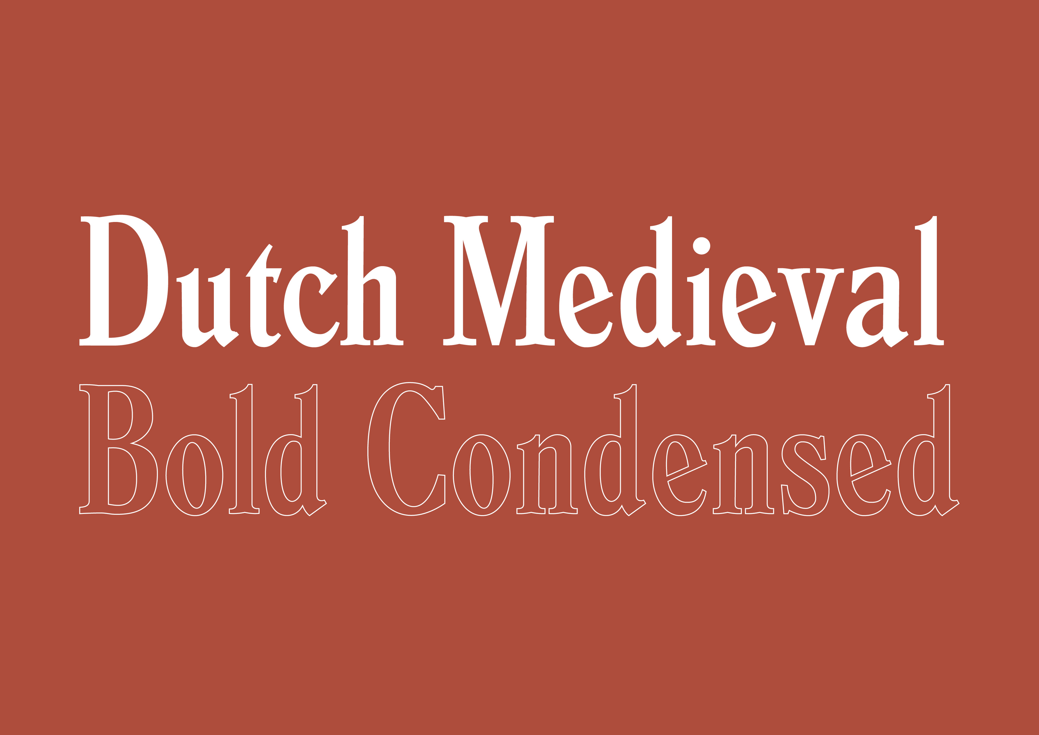
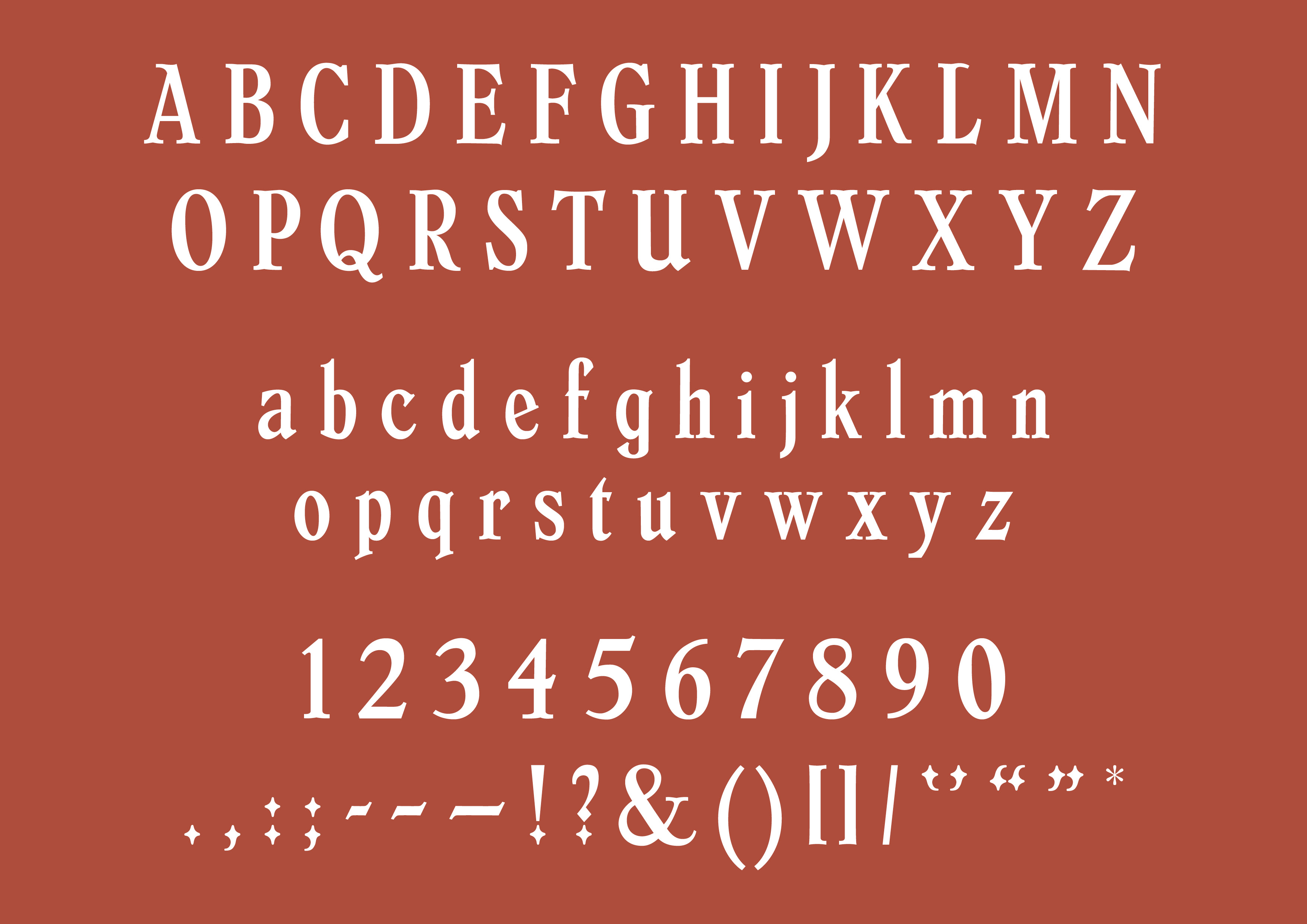 Here are several images from my type specimen of Dutch Medieval. The typeface is best suited for display text; an example of its use can be seen in my social media content creation︎︎︎ that promotes a speculative museum exhibition. Dutch Medieval also works well as a combination of fill and stroke letterforms (big image above; bottom right image.) These images highlight the versatility of the typeface.
© Mei Li Tan 2020–2023. Unauthorized use and/or duplication of this material without express and written permission from this websites’s author and owner is strictly prohibited. Excerpts and links may be used, provided that full and clear credit is given to Mei Li Tan, with appropriate and specific direction to the original content.