Olsson Sans
2021
I created and named Olsson Sans after Philip Olsson, a Swedish engineer who is thought to have introduced media control symbols to audiovisual technology equipment in the 1960s. Consisting of 21 speculative glyphs, its intended use is for a notional piece of technology, the OS Synthesiser, that uses the latin alphabet to represent musical notes instead of traditional modes of transcription.
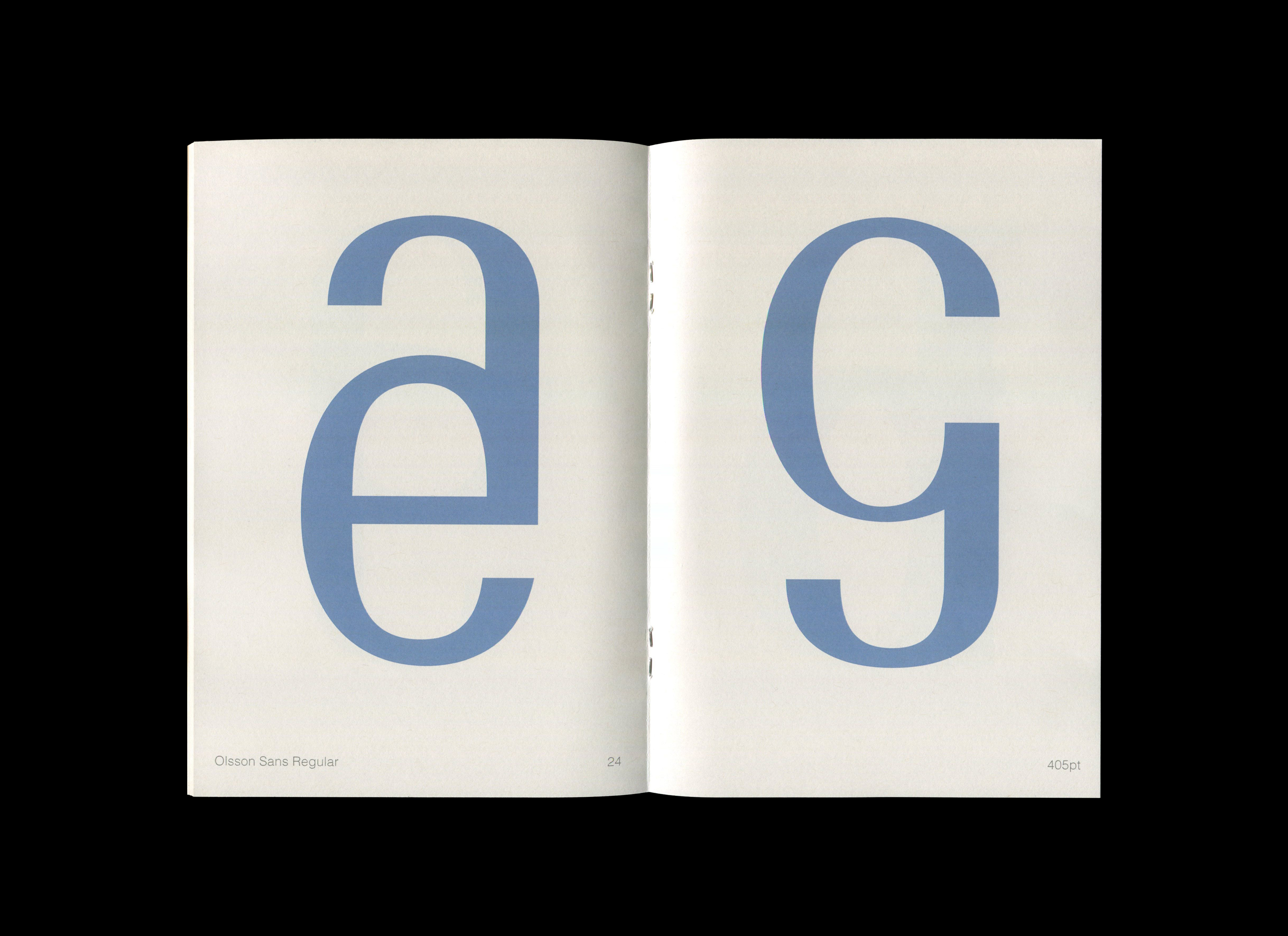
The letterforms are informed by modernist sensibilities, juxtaposed with seemingly intelligible letters to reflect both the obscure origins media control icons and how they are now internationally used. In essence, Olsson Sans is a series of intriguing contradictions.
Supervised by Tristan Ceddia and Rick Milovanovic (TRiC)︎︎︎
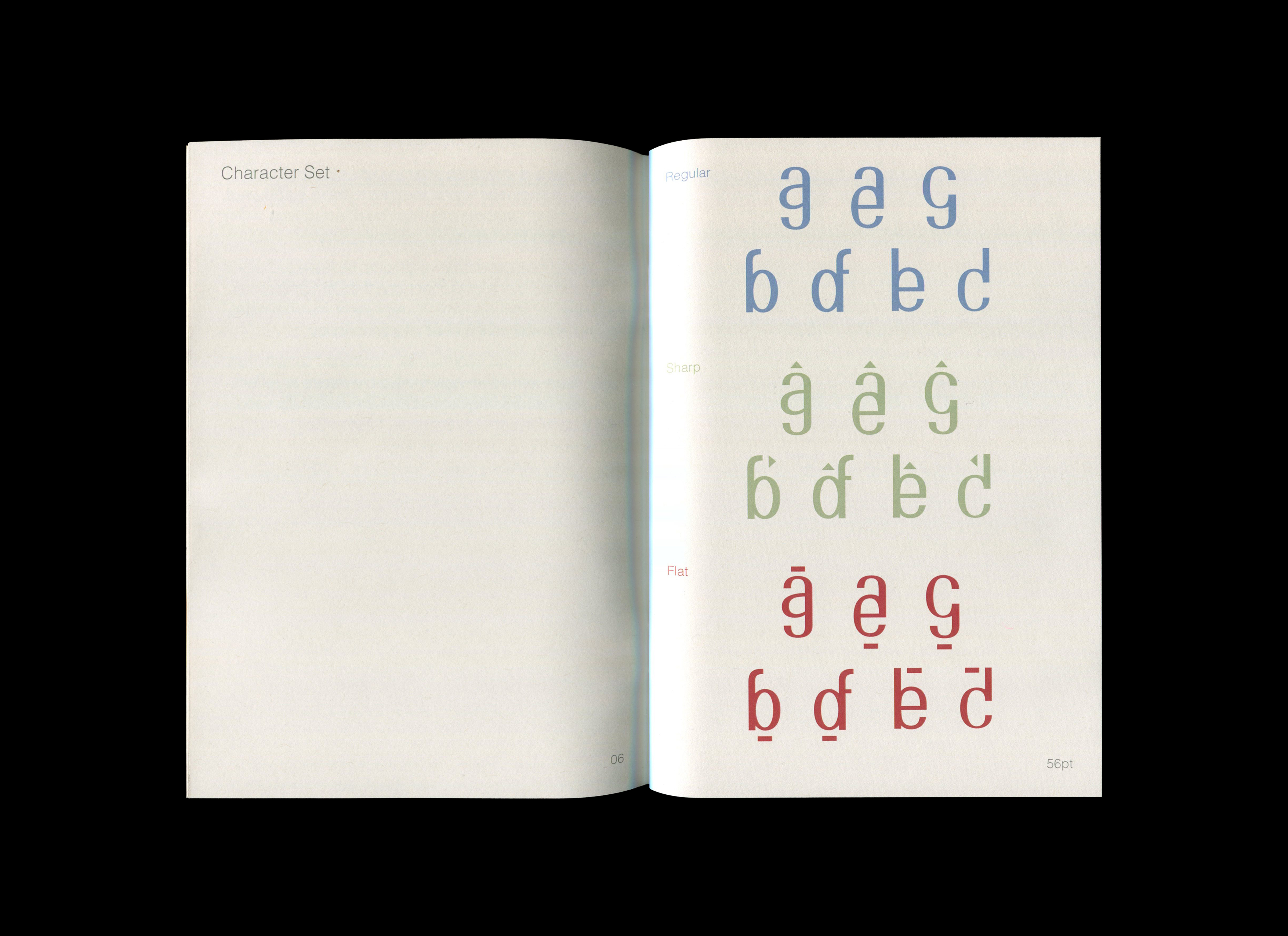


The Olsson Sans family consists of three fonts: Olsson Sans Regular, Olsson Sans Sharp and Olsson Sans Flat, to accomodate a range of music notes and keys, and hint loosely at audio technology. The triangle and rectangular forms denote a sharp and flat note respectively. These further reference media control symbols, namely the eject button which consists of the same shapes, to expand its context.